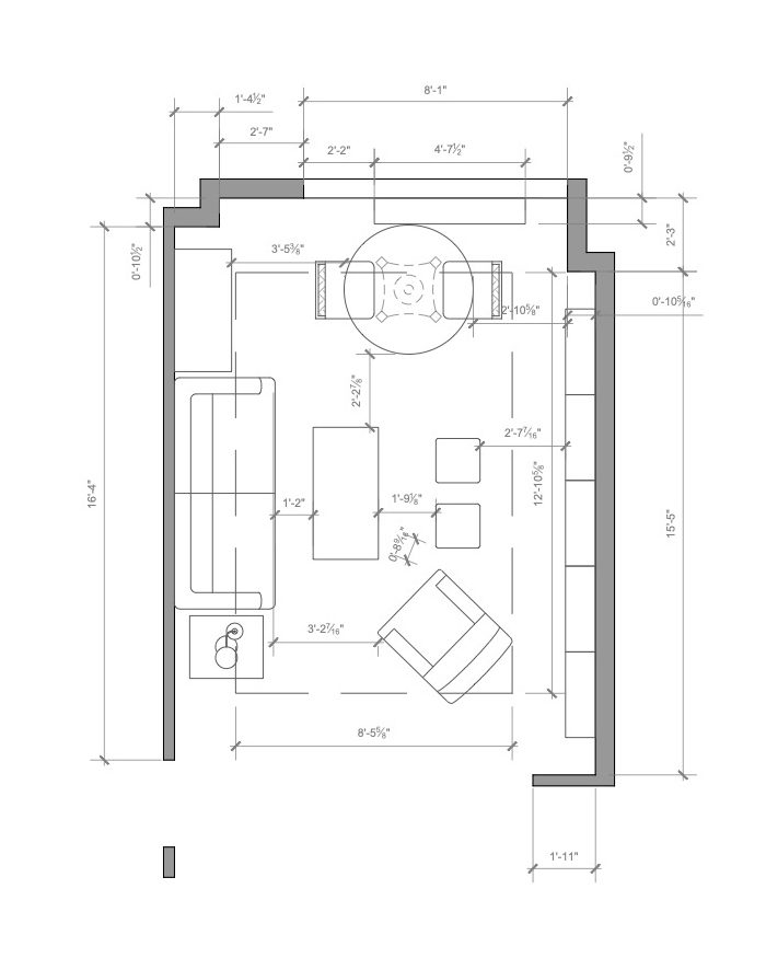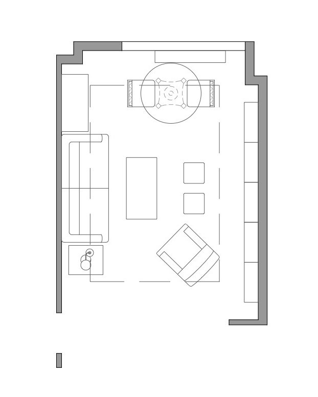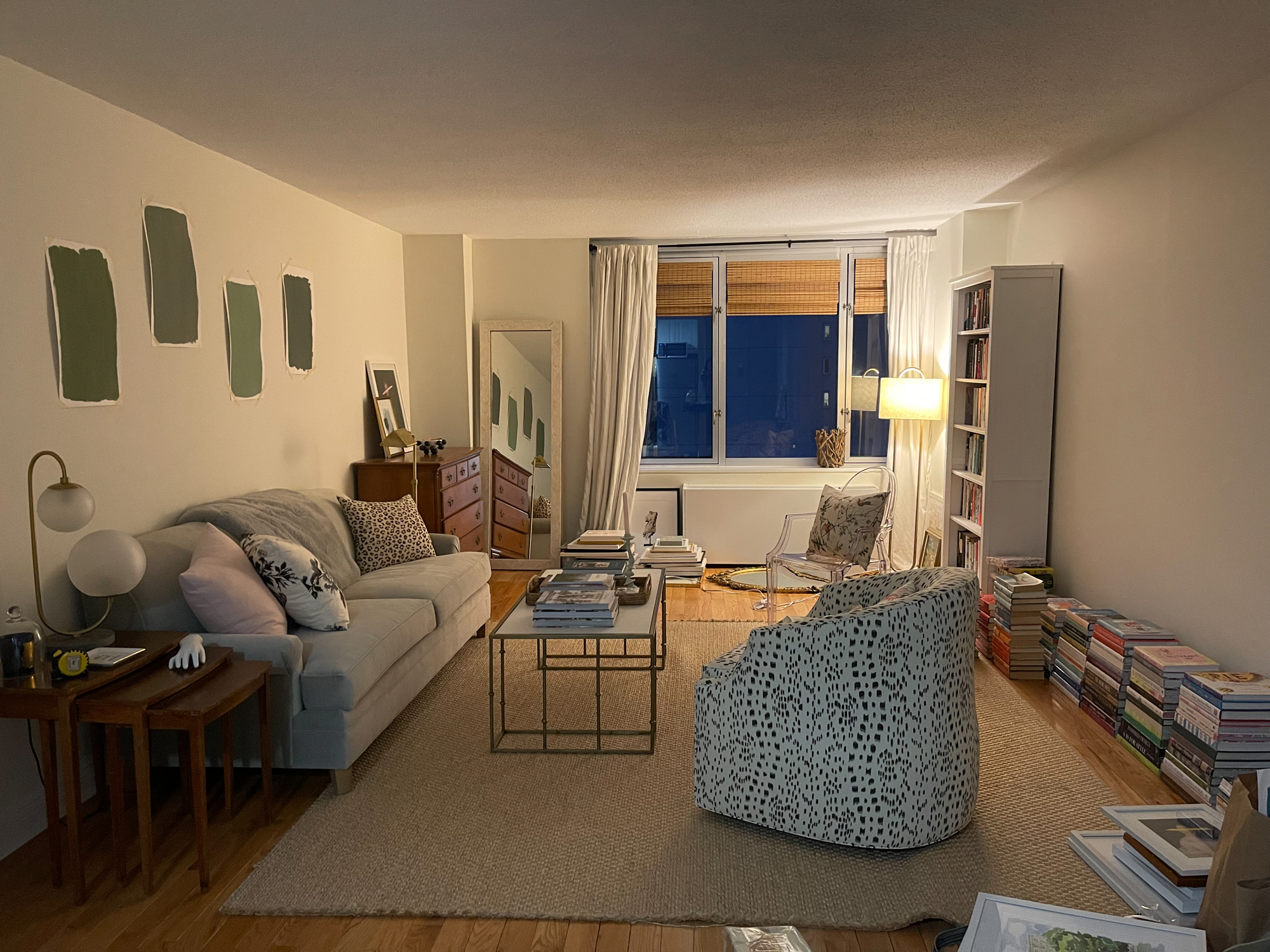
Here’s the floor plan that Jennifer made for me! I’m so grateful for this because I’m an absolute disaster with measuring and do not own graph paper. As I talked about in the last update post, the floor plan changed from when I first moved in. I loved the look of the floating sofa, but when I was sitting on it I had my back to the window and was facing the kitchen/hallway. I quickly realized it wasn’t the best view but more importantly, I hated having my back to the window. So Jen and I decided to give a different floor plan a try – the one you see above. I moved the furniture myself one evening and again must apologize for the messy, crappy iPhone picture – I was still in the thick of tons of photoshoots at the time, really exhausted, and barely keeping my head above water (fun!).
This was right after I moved everything and immediately knew it was a much better layout! First of all, the space looks about a hundred times bigger now that the sofa isn’t blocking the whole back section – this just opened up the space entirely. In addition, this enables me to keep my beloved nesting tables (which weren’t fitting properly before), and I can see out the window. Plus, my sofa view is now of my bookshelves – which, I mean, is there a better view? I think not! So I’m very happy with this new arrangement.
Getting back to the floor plan – you can see, we’re planning to do a dining table in the back corner with two chairs. I wasn’t initially going to do one – despite having ample space, it honestly didn’t even occur to me until some people on Instagram started asking if I planned on one! In all of my time here in the city, I’ve never had a dining table and never really longed for one. But then when I started thinking about it, and saw how much space I have, I figured, maybe it’d be nice! I can actually eat somewhere other than my couch, and I could even bring my computer to it and work there, which might be a pleasant change. I can do puzzles there, since that’s still a thing! I can put a huge bouquet of flowers on it….could be fun. I’m still puzzling over which chairs I might want to put there – ghost chairs? Louis chairs? Will post more about options!
Unfortunately, with the table, there won’t really be room for another chair on the other side of the coffee table, as you can see in the floor plan. It’s a little unfortunate, but with the two chairs at the table and the other chair next to the sofa, is it really necessary to have another lounge chair? Not sure. This is the table Jen suggested – I really like it!
Another thing you can see in the floor plan is the idea Jen had for two little stools in front of the coffee table – I think it would be so fun! I love the Betty Stool and the Birdie Wicker Stool from Society Social so those are possibilities.
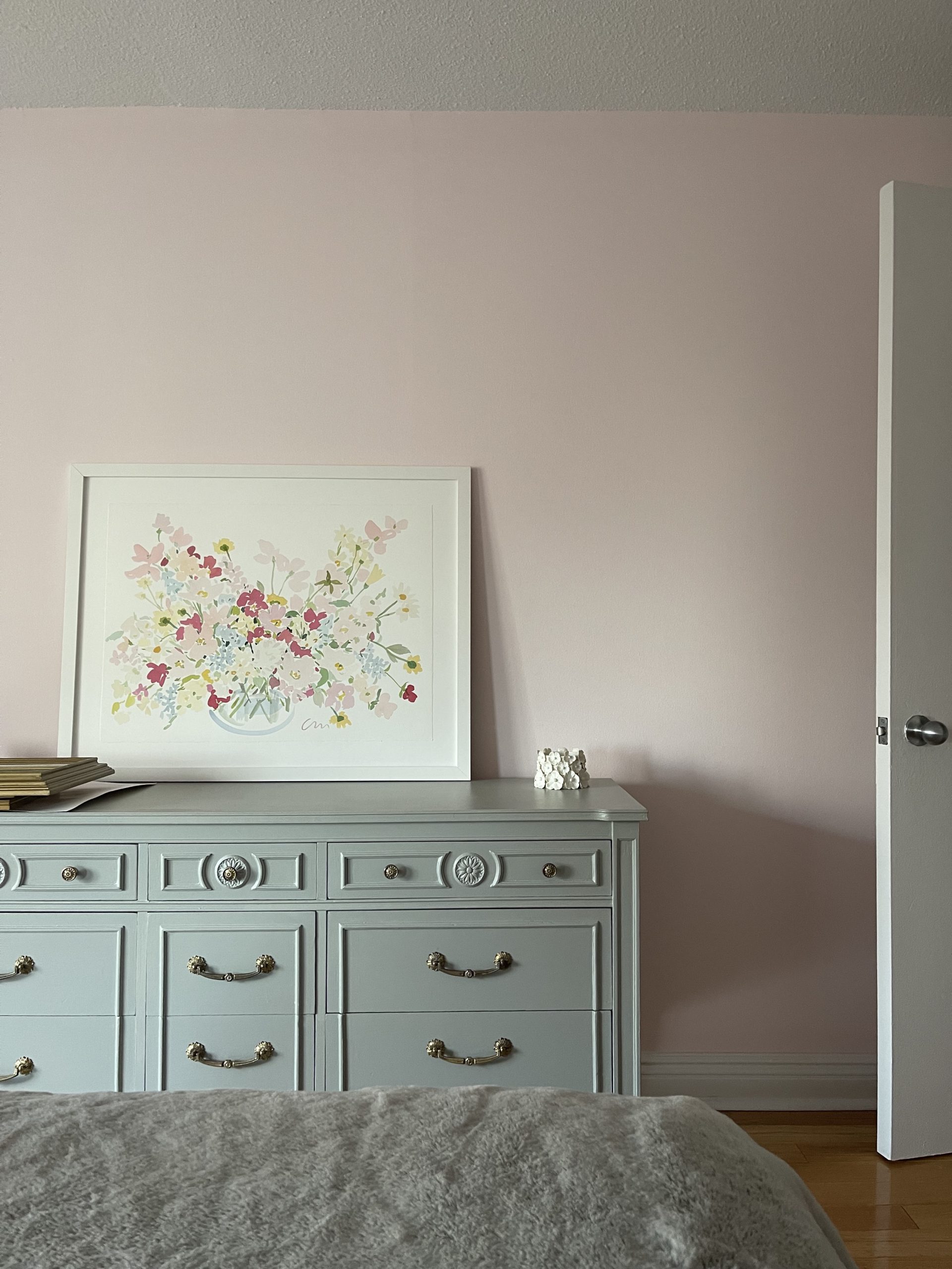
Other changes we made after this – the dresser from my old apartment made its way back! Phew! Living for a few weeks with no dresser in the bedroom, and all of my clothes all over the floor – not fun. So happy to be reunited with this vintage piece that’s been with me through four apartments now. I cleaned and reapplied the original hardware too.
Another bedroom change – on Jen’s suggestion, I moved my vintage bookcase from the bedroom into the hallway, which I’m really pleased with. For some reason I just didn’t like it in the bedroom – feels much more like a hallway or living room piece to me. And now it’s right near the doorway so it’s a good spot to drop mail or keys or whatever. So this opened up the space near my window in the bedroom, and the plan is to put my Society Social chair there, which opens up room in the living room for a new, chintz chair! I think it will be a fun little window seat/reading nook for the bedroom, and there’s so much space next to the window so it makes sense. The only thing is that I haven’t been able to try it yet, because it won’t fit through the door so I need to take it off the hinges temporarily, and then try the chair there, and put the door back on. Nothing is simple! But anyway, once it’s there maybe I’ll also put a nice floor lamp next to it for reading.
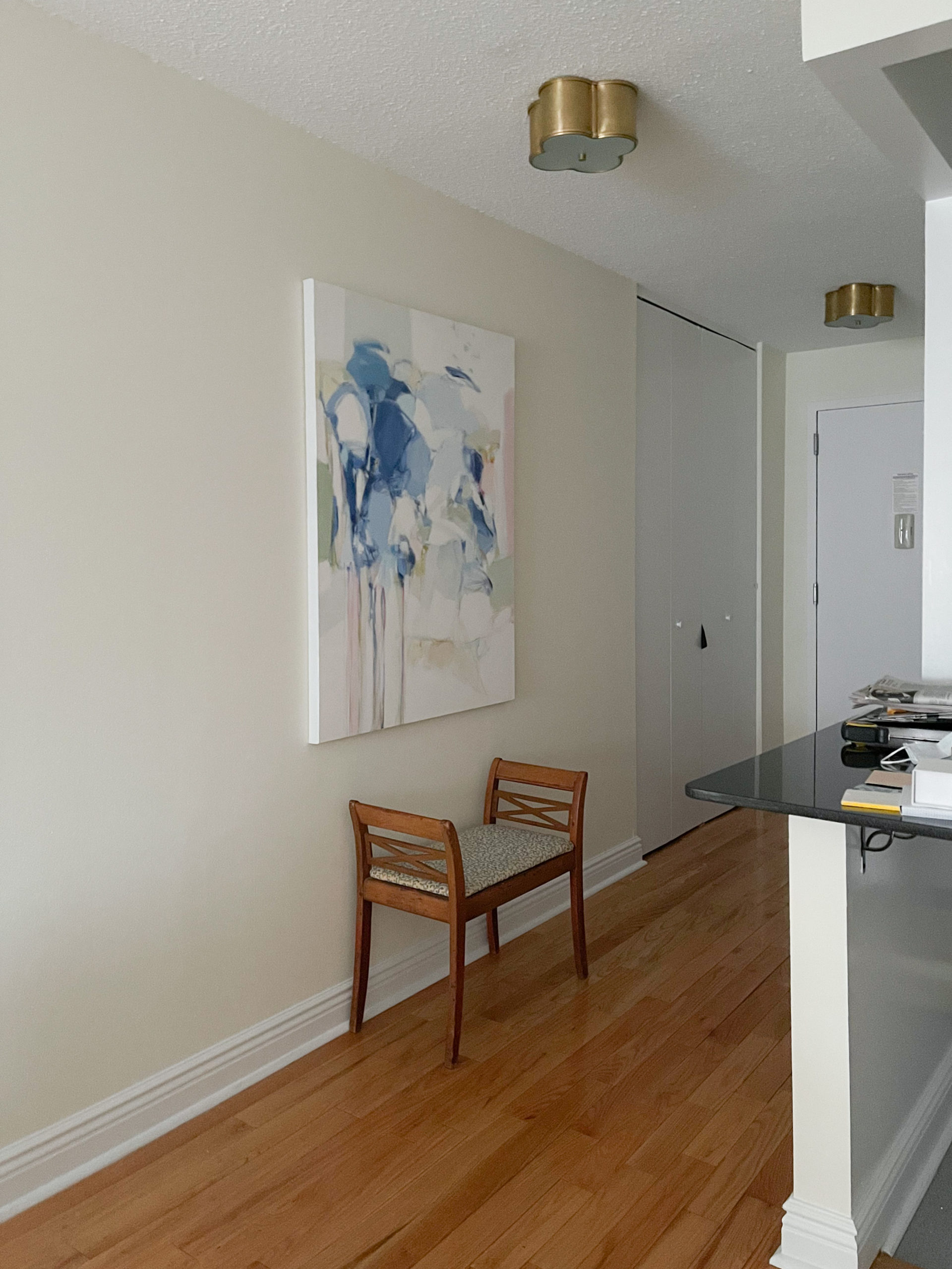
Next update is that we hung my large Christina Baker painting in the hallway and plan to keep the bench underneath it. The bench is currently at the upholsterers waiting for fabric so it can be re-covered. I think it could be nice to add some sconces on either side of the painting, since the wall is massive and the painting (while quite large), obviously doesn’t completely fill the space…so we’ll see what happens there! And I just love the Circa Lighting flush mounts that Jen picked out for me for my old apartment. They fit perfectly into the new space, couldn’t be happier with them!
Next up, I can’t wait to share my updated gallery wall and the bookshelves with you – no more crappy pictures from here on out except for actual “befores,” lol. There are still so many things I need – maybe I’ll do a post next talking about all of the stuff I still need to purchase for the apartment. My Mom said I should make a list so I can budget it out but I just think that will be terrifying to see, so I was avoiding it, lol. But could be a fun post so I’ll think about that for the next one!

