

When beloved photographer, EHD mentee, and TV personality (have you watched her new show yet??), Keyanna Bowen, sent us this project she photographed for Christie Veres, we knew instantly we wanted to share it on the blog. Christie Veres is a Delaware-based interior designer who is currently renovating her historic traditional stone home built in 1809, and the rooms you are about to see check all of our boxes–they’re colorful, full of personality, stylish, practical, and the before and afters are almost unrecognizable.
But another aspect that sparked my interest is that she has one of those movie-esque corporate-to-designer story arcs that we all love to hear about. Before she made the full-time shift to interior design, she worked in Washington, D.C. for about ten years for the government in contract negotiations. After hearing this I needed to know more, so I asked Christie what that career move looked like for her. Here’s the story from Christie: “When my husband and I relocated to Wilmington, I kept my job for a time working remotely. The combination of remote work, a new city, not knowing many people, and being in the last trimester of my pregnancy led me to spend a lot of time at home. Spending that much time at home awakened an interest I had always had in making rooms “feel” certain ways. I quickly began to realize how passionate I was about design when I noticed the extent to which I could quiet my mind and become immersed in the creative process. I decided to take some classes, which really helped me with the technical aspects of design, especially the computer programs for drawing such as AUTOCAD. Still, the shift was scary – especially taking that initial leap. I was fairly far along in an established career path, and it was difficult to pause, step back, and transition to an entirely new industry. But once I took that step, I think it was the challenge that motivated me. Learning how to create a business, creating that business, finding solutions to problems that arise on job sites, and connecting with trades, vendors and clients have given me a sense of momentum and further reinforced my love of design.”
Well, I am already inspired! Now that you have a bit of background, let’s head to the reveal portion of this program:

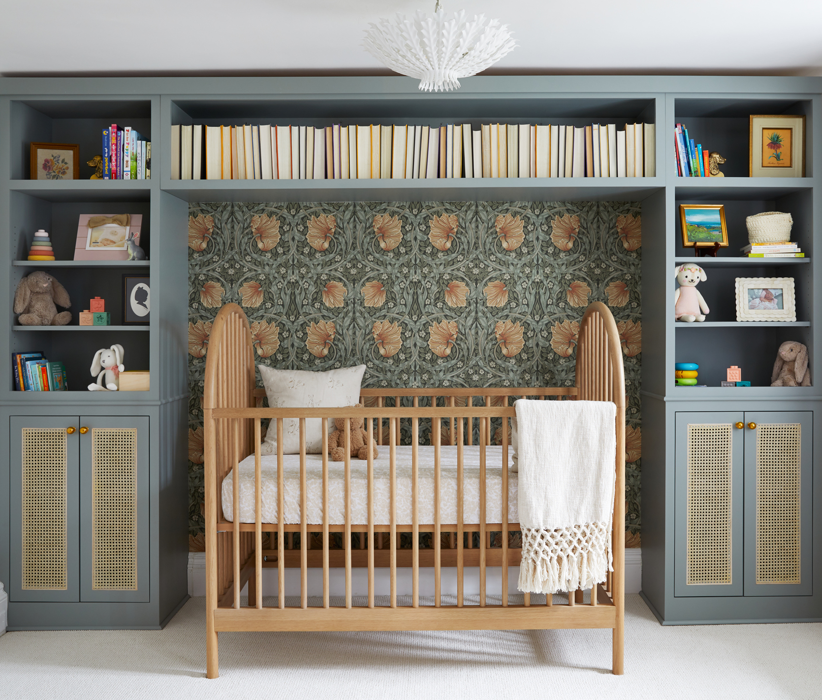
Logistically speaking, Christie is still renovating other parts of her home (next up is the kitchen, laundry room, and powder room) but she always knew she wanted to finish her nursery and son’s room first. When they moved into the home, she was pregnant with her second child so it was important for her to have those rooms settled, so her family could feel at home. Her goal was to create a nursery that would feel calming and peaceful with an English garden vibe since she knew she would be spending a lot of time in there with her newborn daughter. And it’s safe to say she succeeded. This room evokes a calming sensation right away, with the perfect balance of soft colors and bold yet comforting patterns.

The wall-to-wall bookcase is custom and gives this room a beautiful focal point. Christie designed and drew the vision and had Salvage Works bring it to life, and I just love that she chose to wallpaper the wall space in the center, creating a perfectly inviting nook for the baby’s crib.
The custom shelf, wallpaper, and pattern curtains take center stage in the design, so the other elements are mostly neutral and understated which gives this room a lovely well-rounded look and feel. I love the wooden crib which brings a natural, cozy element to the space.

Crib | Wallpaper | Curtain Fabric | Chandelier | Art
Oh, that chandelier is just perfect for this room. It catches your eye but isn’t too overwhelming or loud.

The curtains are from Urban Loft and are made with the Rebecca Atwood Blooms fabric. It’s a really lovely pattern that adds a playful, whimsical element and ties in the warm pink colors throughout the room.


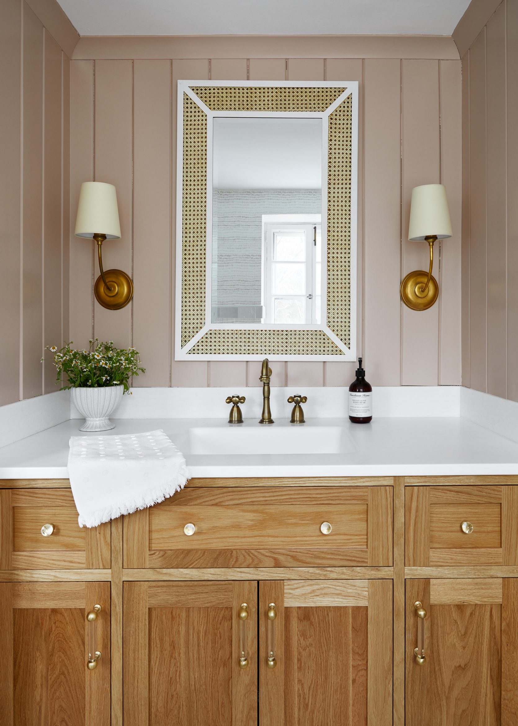
You wouldn’t know it from looking at this gorgeous bathroom, but this is a room that presented the biggest challenge during the renovation. Christie explained that given the age of the home, there was a thick mud (mortar) bed under the tile that needed to be demo-ed so it was a very labor-intensive process to remove the mud bed and mesh nailed to the subfloor and to install a new mud bed to ensure the floors were level before the new tile was installed. Any renovator knows that every project comes with unforeseen challenges, but when the outcome is as satisfying and beautiful as the above bathroom, I expect it’s all worth it.

The original bathroom had square tile going up about 3/4 of the wall, with wallpaper on the rest of the wall to the ceiling. I really love that she replaced the tile and wallpaper with paneling and painted it a warm blush pink, that pairs so beautifully with the wood vanity. All the brass finishes are just the icing on the cake.

That Rebecca Atwood wallpaper is so good (it’s one of our favorites!). The small scale of the wallpaper paired with the large zellige tiles creates a dynamic look that is very appealing, and I love that she went with a different shape floor tile, too.

In her son’s bedroom, she went with a predominately blue color palette because that is his favorite color, and then complemented the color scheme with cheerful, classic patterns. I love that she played with several blue hues and sprinkled them throughout so the room feels layered and intentional.

I am so impressed with how she mixed patterns and scale to give this room a relaxed, playful vibe. One of my favorite details is what looks like an extra large baseboard behind the bed. I wasn’t sure what it was at first so I asked Christie, and she explained it is actually a cast iron baseboard radiator that she painted the same color as the window casings! It’s so cool looking and is such a good hack to disguise a not-so-aesthetically pleasing radiator.

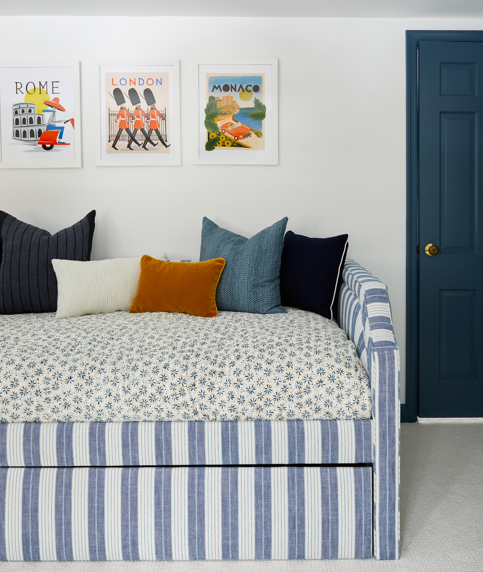
Connected to the boy’s bedroom is this sweet and fun playroom. I love that she extended the color scheme into this room which creates a continuity between the two rooms.

How cute are those city illustrations? Also, I can stop looking at the bedding combination paired with the daybed pattern. The patterns and scales are different enough that they play with each other nicely and create a very interesting, cozy look.

In the bathroom, she extends the blue theme with a playful cloud wallpaper (by Rebecca Atwood) and classic dark blue tile. The cafe curtains are made from Marika Meyer fabric and I love how they add another small pattern, making the bathroom feel layered and eclectic.

How perfect is that light wood vanity? I love how it contrasts with the dark blue tile, and that she accentuated the texture with a bamboo box for toiletries.

Between the kid’s rooms and her home office is this lovely hallway. What struck my eye immediately was the stair banisters and I had a hunch that they might be original to the home because of how much charm they bring to the space. It turns out they are original, and it’s so cool that Christie was able to salvage them during the renovation.

Paint Color | Wallpaper | Rug
Christie wanted to create an office that would feel warm and ageless to highlight the historic charm of the space. For the paint color, she chose Pigeon by Farrow & Ball because she was going for a moody feel, and she wanted it to contrast with the white walls in the hallway but not be too overwhelming. The color is really stunning and it pairs so wonderfully with the wallpaper ceiling. By the way, doesn’t this room just make you want to go run and wallpaper a ceiling?? It’s a really great way to bring the eye up and make the room feel cozy.

One of my favorite things about this room is that she kept the original paneling, fireplace, and candlestick sconces. It really gives the room a historic, classic essence that is so hard to achieve without vintage elements.

That Dutch door is AWESOME and also original to the home, as is the hardware. So cool. I love how the paneling continues on the door and cabinets, to give the room a lot of depth and texture.
Can we take a moment to admire the bookshelf styling?? I love everything that she chose to style with from the vintage typewriter to the gold candlesticks to the vintage paintings.

Huge thanks to Christie for letting us tour and share her fabulous home. We can’t wait to see more! Now let’s give it up for the before and afters:


*Photos by Keyanna Bowen
**Design by Christie Veres
The post Suprise Home Tour! See How This Designer Transformed A Nursery, Kid’s Room, & Home Office In Her 1809 Historic Home appeared first on Emily Henderson.


