I’m here, I’m settled, I’m making progress.
It’s been a little over a month since I moved out of my sun-drenched, eight-windowed Upper East Side studio apartment, and into a one bedroom in the same building. And so far, I’m very happy with my decision! I loved my studio but I’m glad to see that so far, I don’t really miss it. Well, maybe it’s more accurate to say, I haven’t been thinking about it much because the new place has been occupying my thoughts so thoroughly. And I traded all of that light for a LOT more space, which has been pretty interesting (and awesome). Here’s what’s been happening:
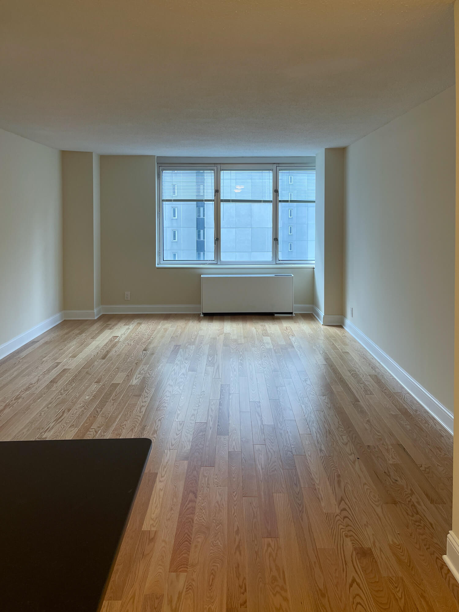
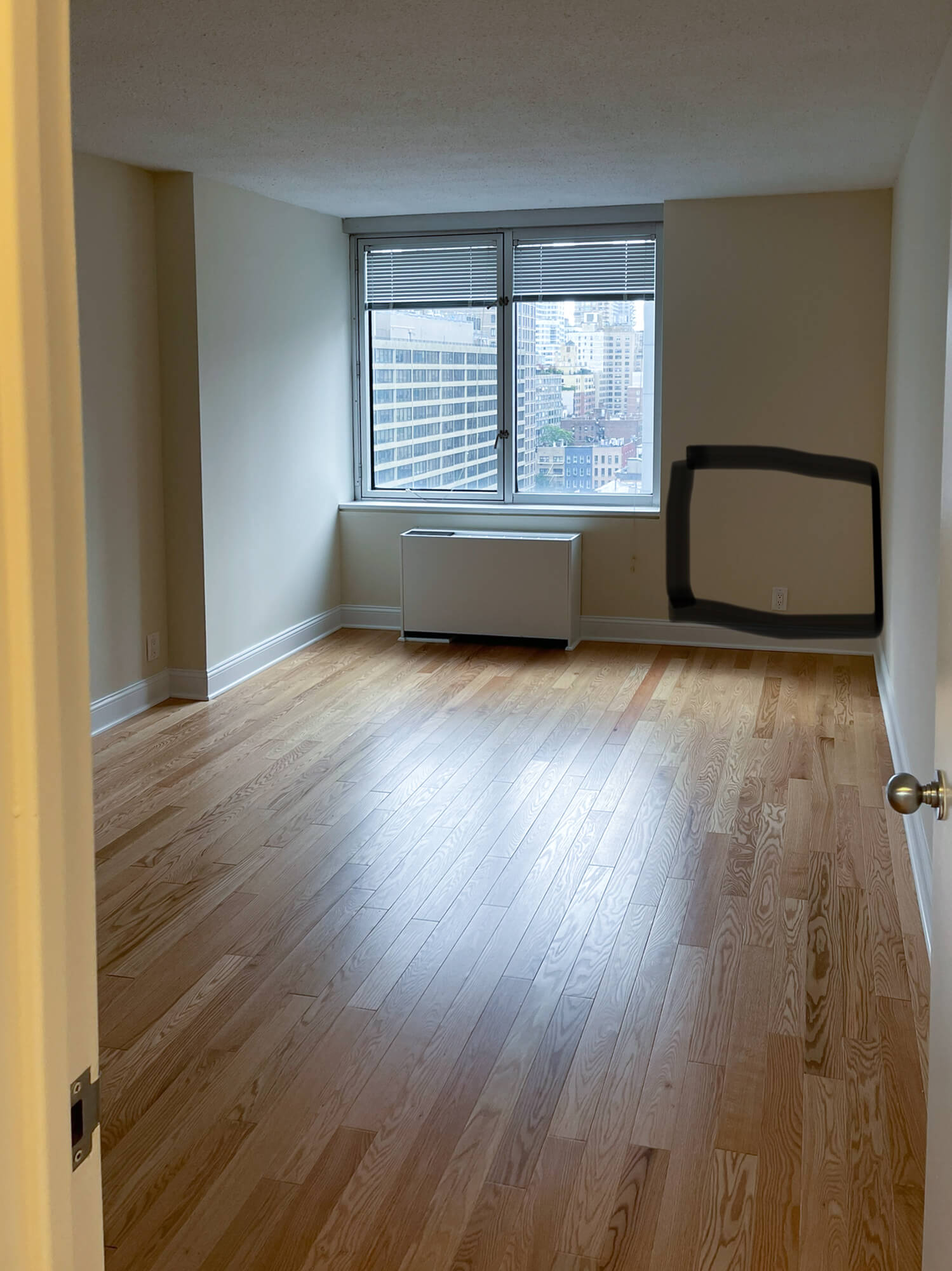
Here’s what it looked like before I moved in:
Top left is the living room looking in from the entry hall, and right side is the bedroom (that black box is where I drew in where I wanted the desk to go when this photo was on my phone, haha).
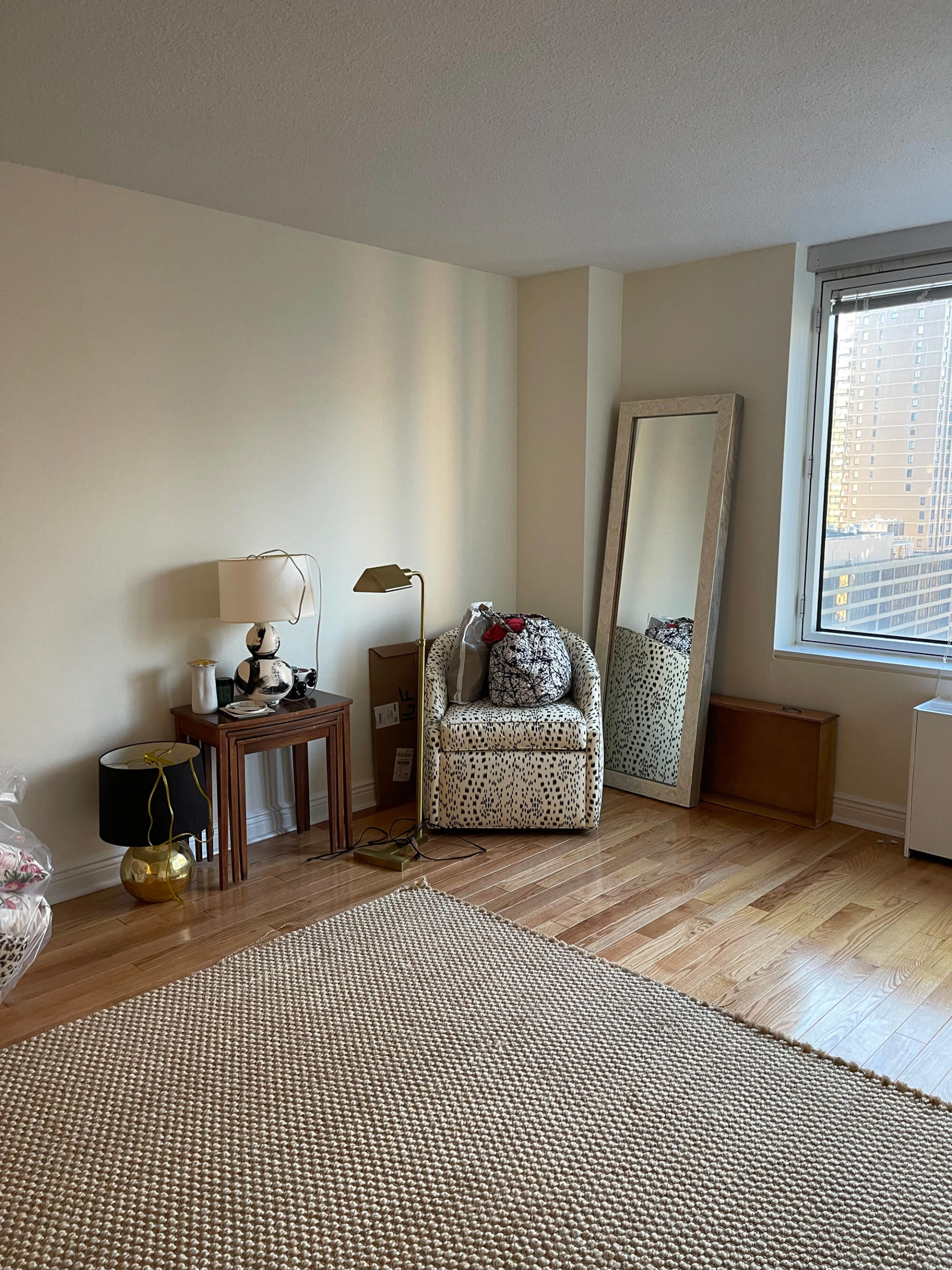
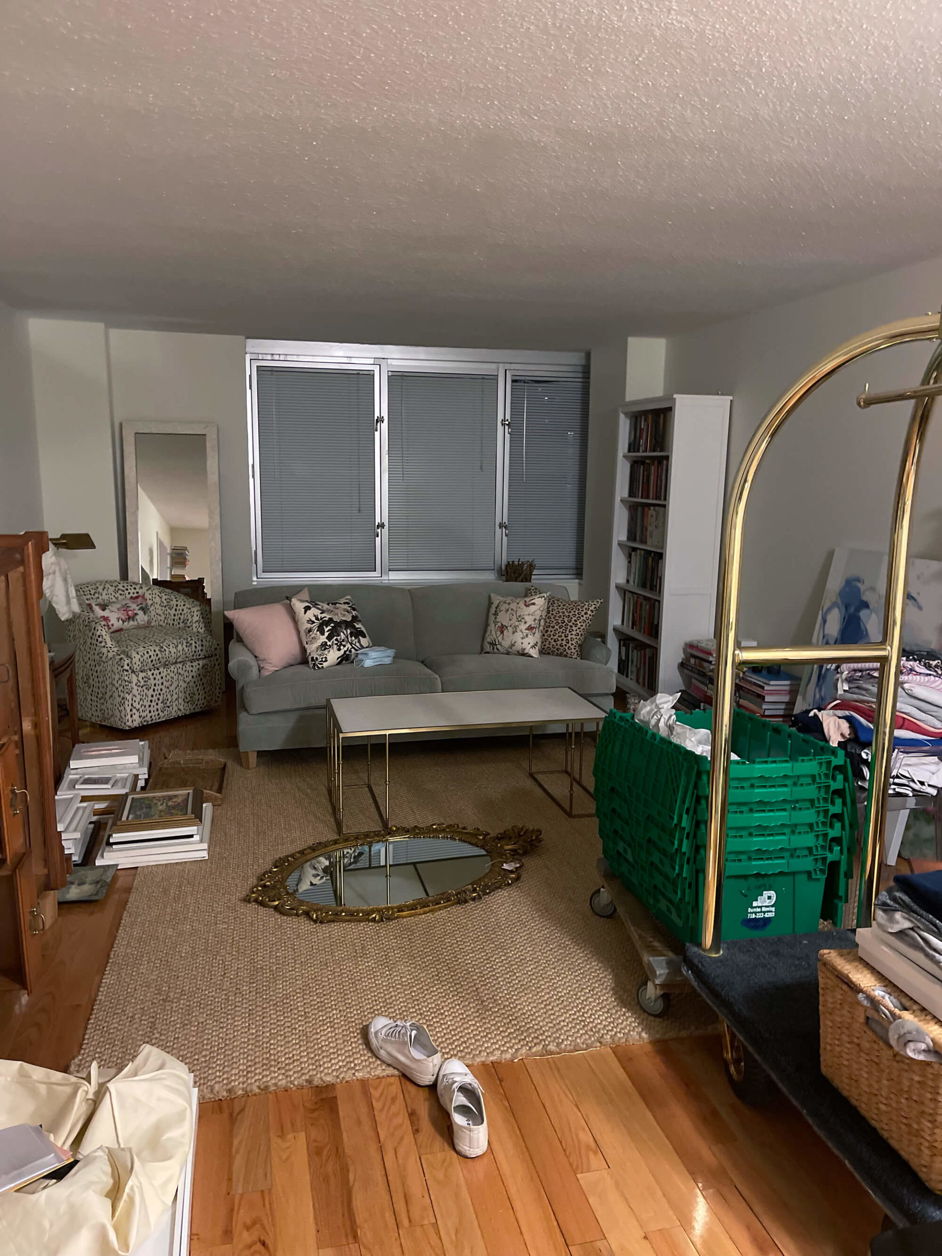
Here’s how it looked on moving day/in the days after:
Moving day, just loading stuff in (why am I sharing these messy ugly photos? Lol). That vintage mirror you see on the right lived right there on the floor for what felt like an absolute eternity! I couldn’t get it hung until I picked a paint color, which wasn’t something I wanted to rush too much on.
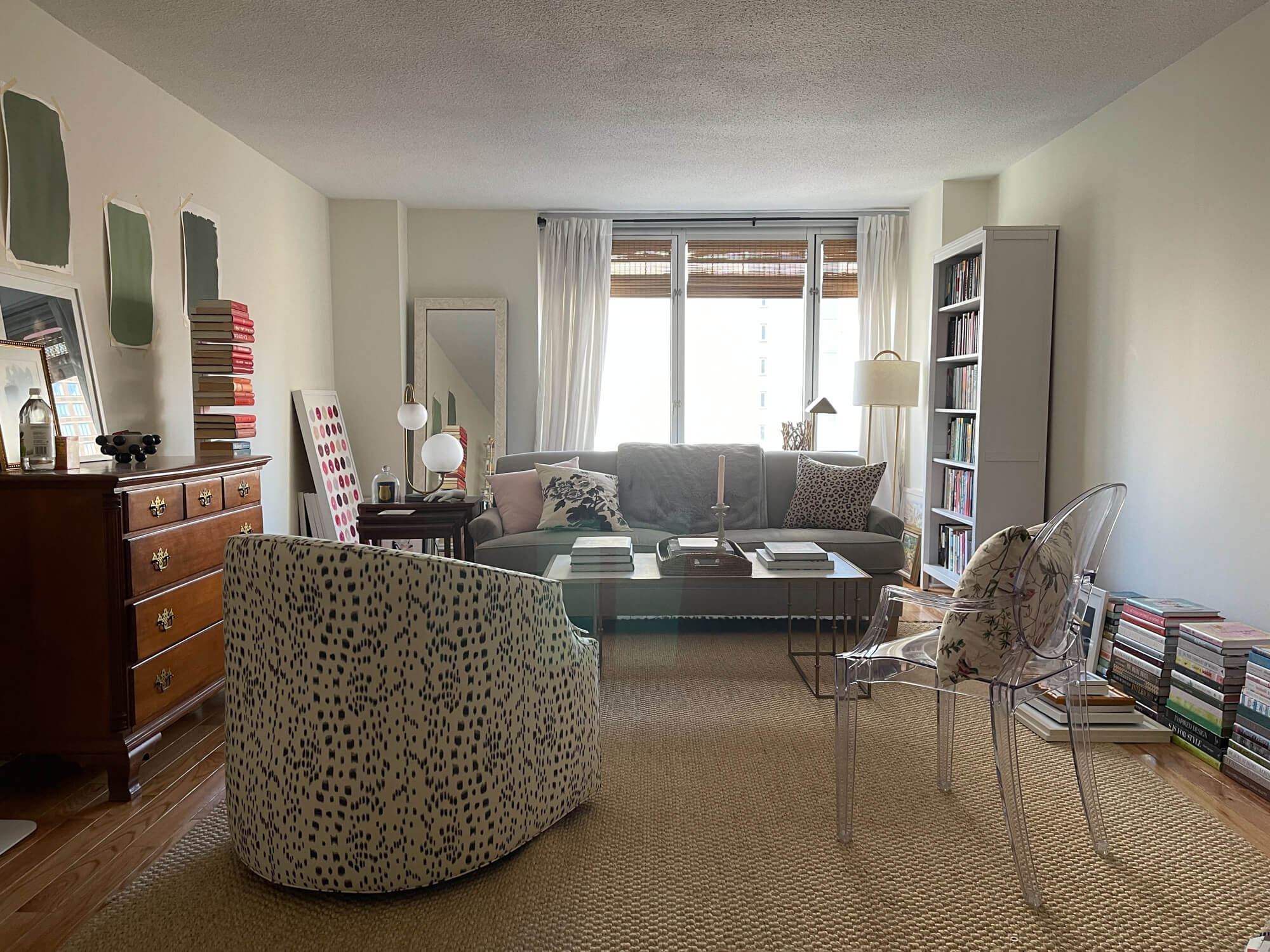
Again, apologies for this hideous and weird photo. Things were truly so crazy with the move and SO MANY photoshoots happening at the same time that I didn’t really have the presence of mind to take non-hideous photos. But anyway! The worse the before, the better the afters, right? So you can get a sense of the floor plan I settled on immediately (before I even moved in) – sofa in front of the window (with a lot of space behind the sofa that you can’t see, which was great because all of the art from my gallery wall that I couldn’t yet hang could be hidden back there), dresser on the left, bookshelf on the right, and chairs facing the sofa. That floor plan has since changed and been vastly improved upon, but at the time I really thought it was great! I do love floating furniture but it poses various problems, not the least of which is the difficulty of lamps that need to be plugged in (no floor outlets here, unfortunately). You can also see the paint swatches I pretty immediately started testing out for the living room – green!
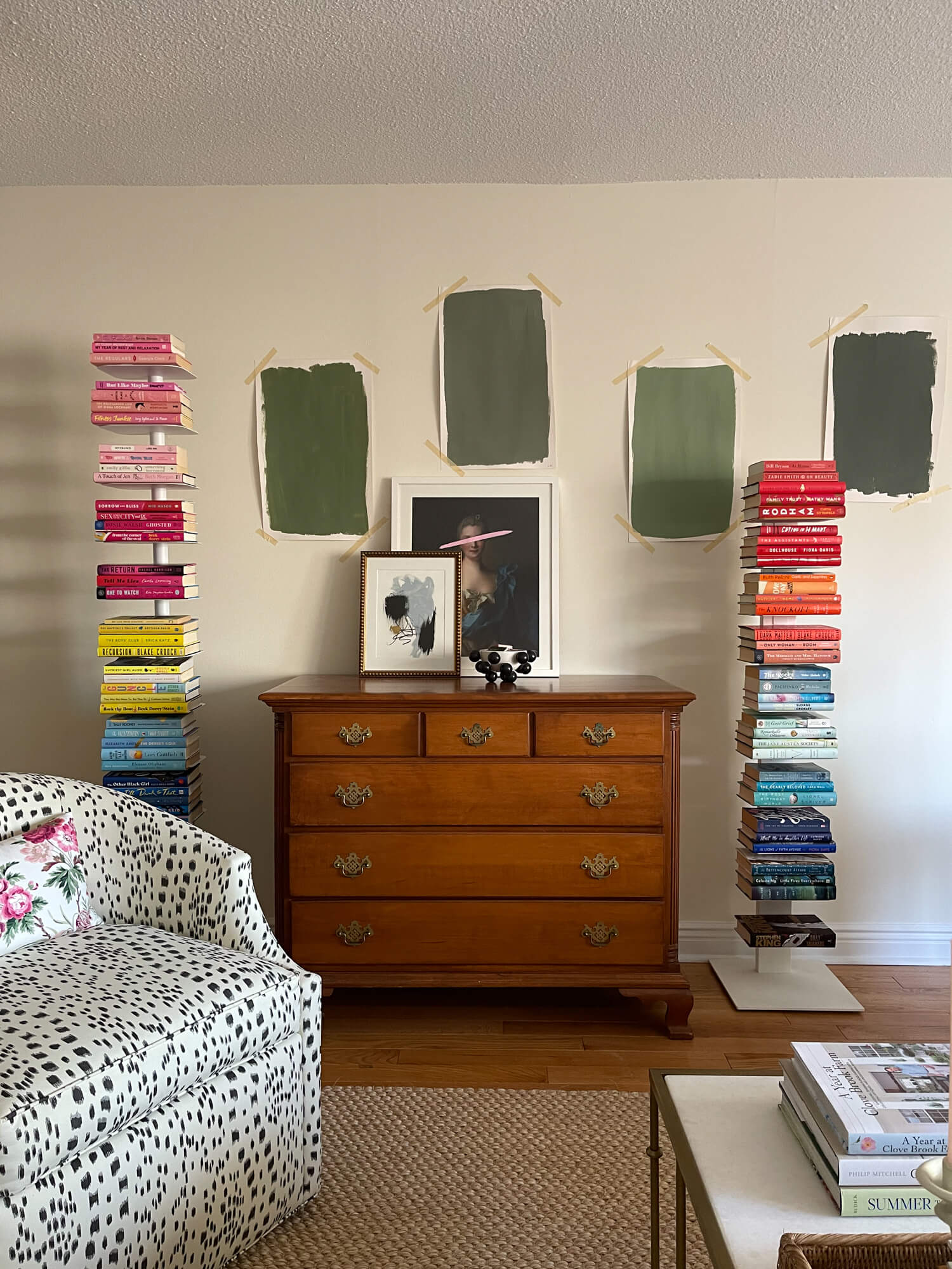
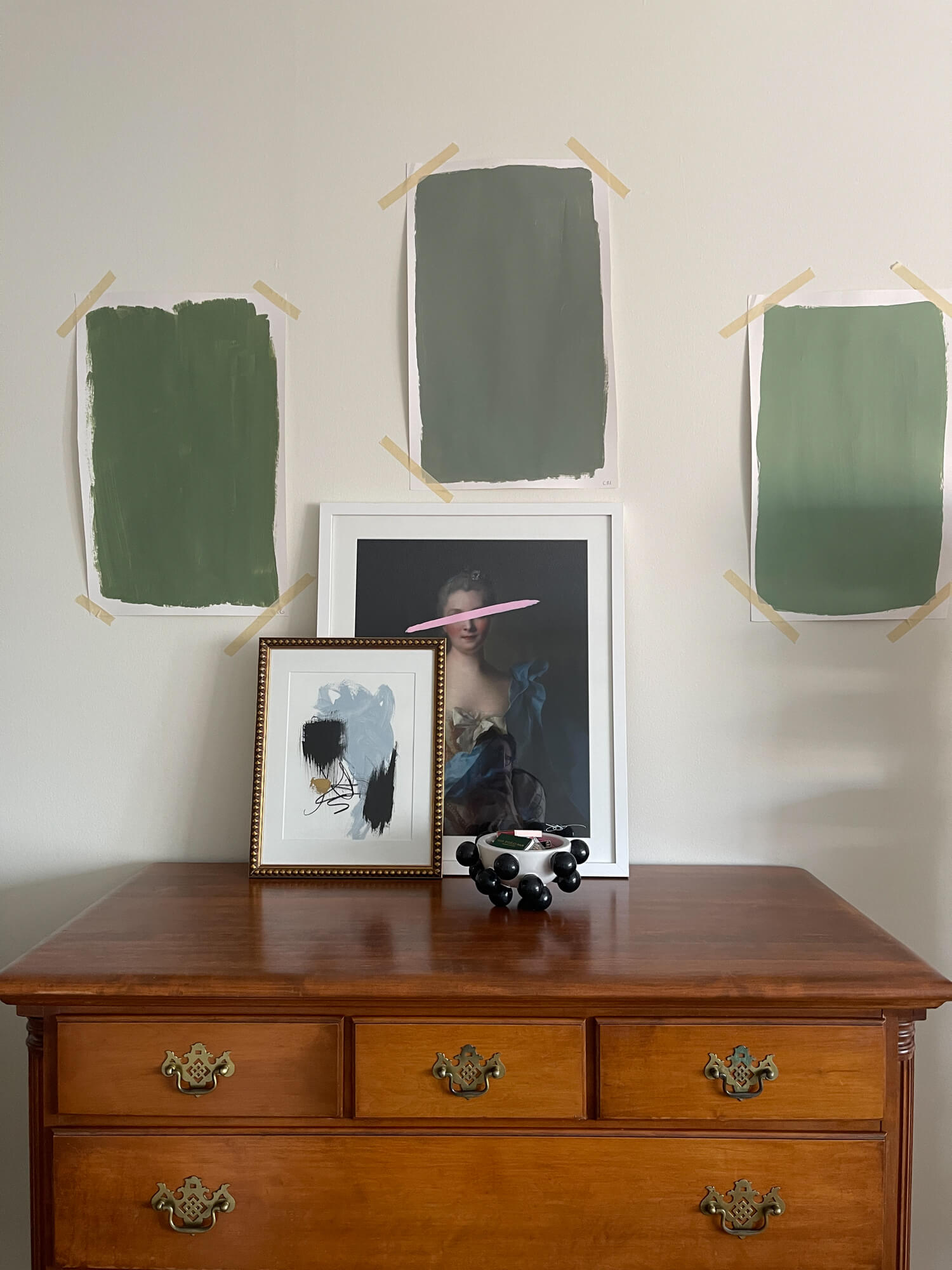
See, I do really like the floating chair in front of the dresser like this (but we changed it for the better). The two vertical bookshelves I’m probably getting rid of, but at the time I just thought they looked cute on either side of the vintage dresser – always love that juxtaposition of old and new. On the right, the dresser and the paint samples…two sagas in themselves, believe me! Paint has been settled but the dresser is still a work in progress, shall we say. I’ll share more in upcoming posts!
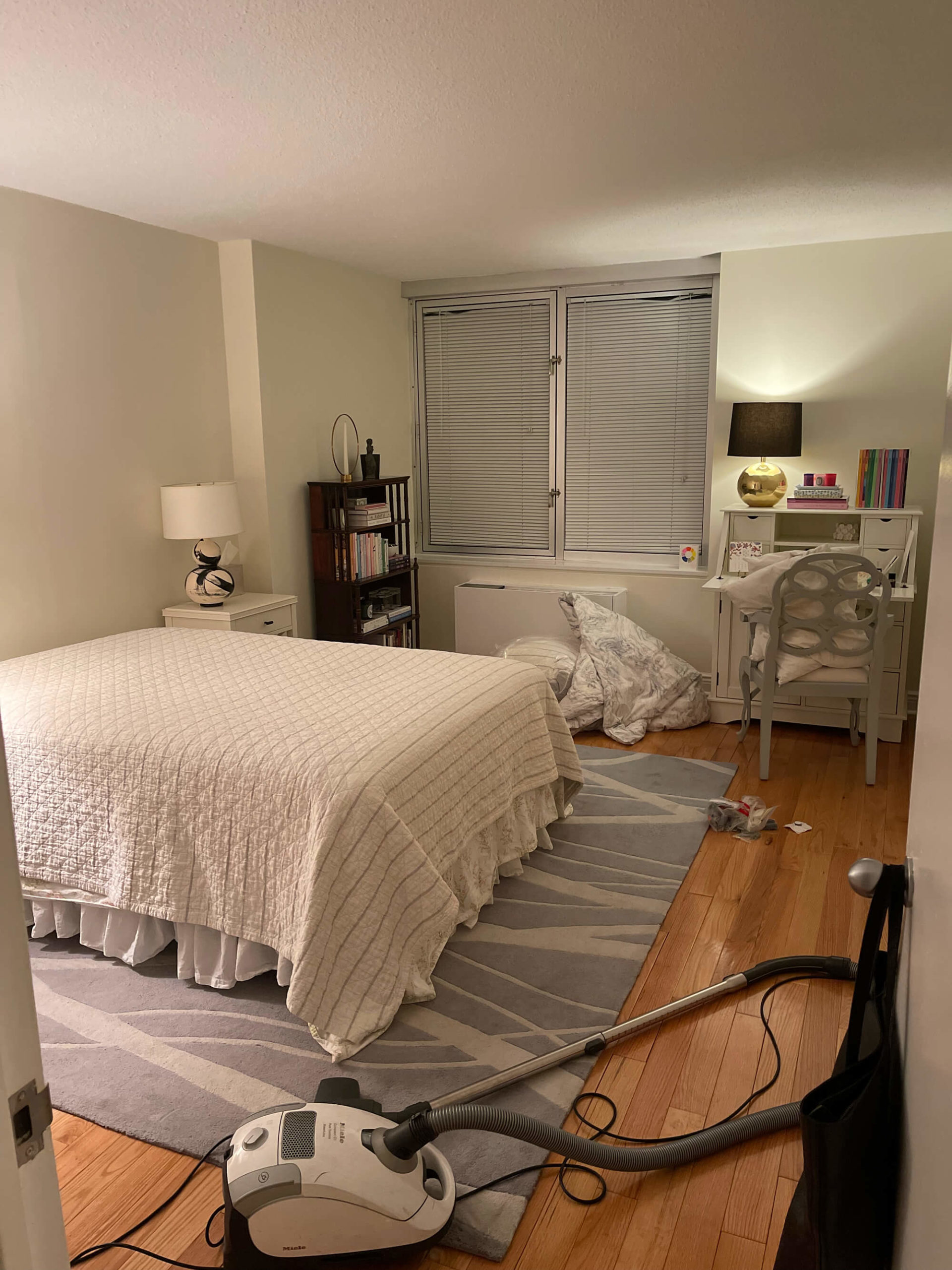
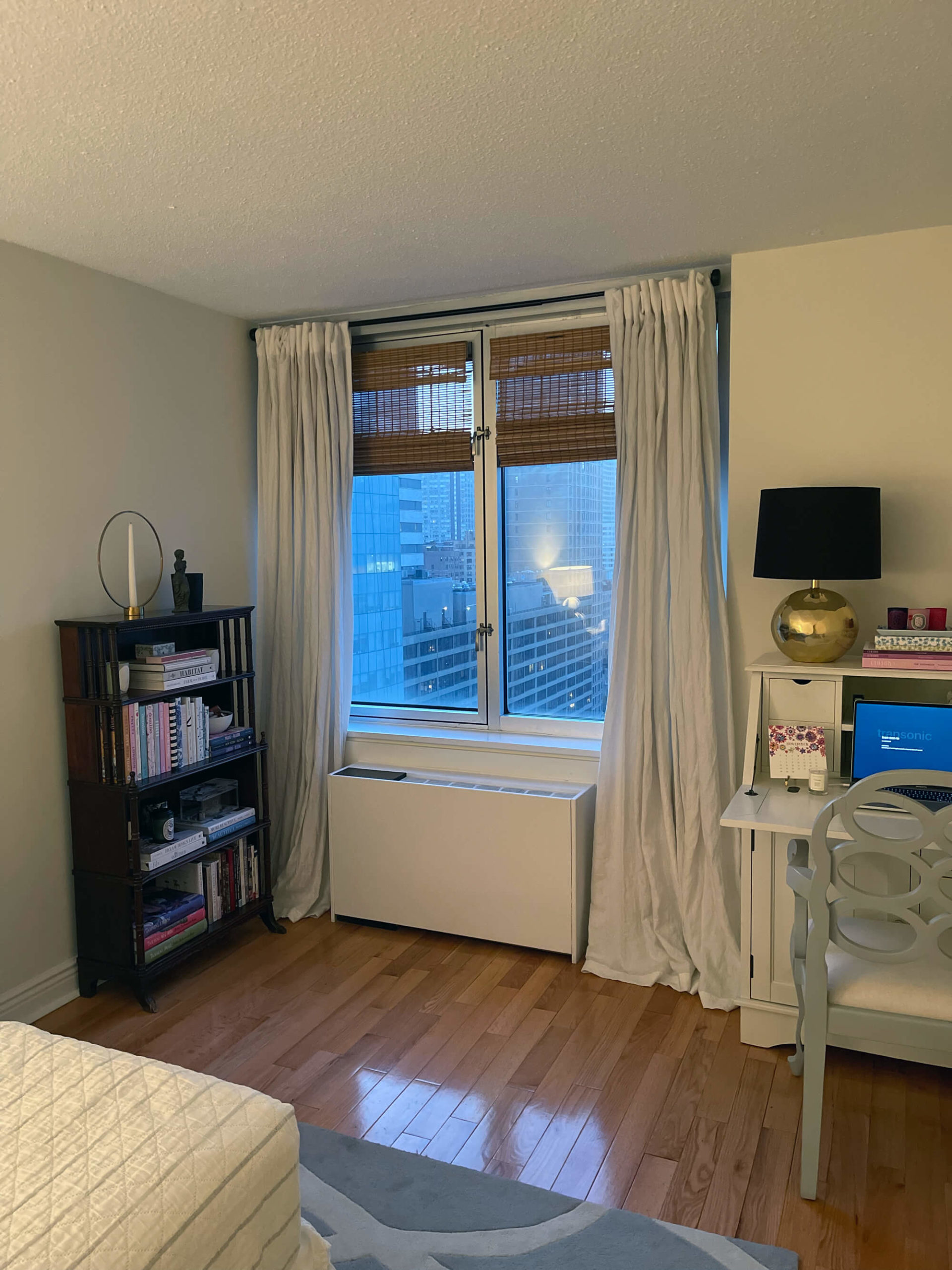
Here’s how the bedroom looked right when I moved in. There didn’t seem to be anywhere else to put the little vintage bookshelf, so I put it here but wasn’t crazy about it. It just felt more like a living room or hallway piece to me – and it’s since been moved into the hallway, which I think is better. Other than that the bedroom layout is much the same at this point. However! I did make one big mistake which was that I did not realize that a dresser would fit perfectly across from the bed (who knew?!…I’m not the best at measuring) – and I had already sent my old dresser home to my parent’s house. It was rough when I realized that that dresser would fit PERFECTLY across from the bed…so I just paid the person who had driven it out to go back out and pick it back up and bring it back in. Was that the best use of time or money? Nope! Mistakes were made. But thankfully, it was able to be rectified and my beloved dresser is back and better than ever.
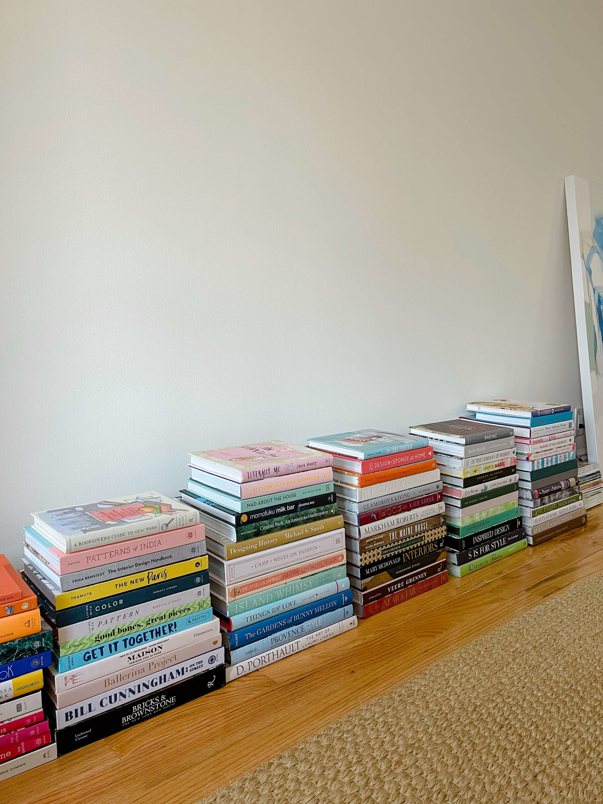
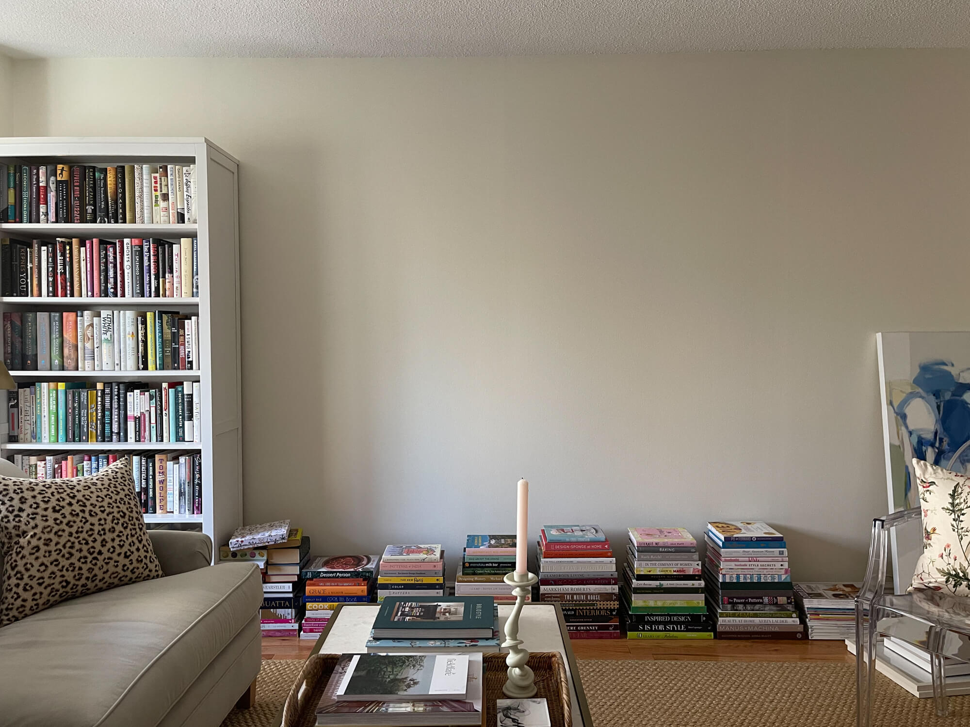
The whole time I was scheming to do wall to wall bookshelves on this wall, so I just stacked my books over there as placeholders. Can’t wait to share more about the bookshelves! (also still a work in progress).
That seems like a good place to stop before I move onto talking about the first changes I made – picking paint colors, etc. But I saved the best for last! The most fun and exciting news about the apartment decorating is that I’m working on it with Jennifer Hunter, a fantastic New York City based interior designer who I’ve known for many years now. I am SO excited to collaborate with Jen on this project and just soak in all of her insight and expertise. She’s already helped me with the floor plan, the paint colors, and so much more, and I’m going to show you all of that in upcoming posts. We have tons of plans in the works and I cannot wait to keep sharing the progress, here and on Instagram. Thanks so much for following along!

