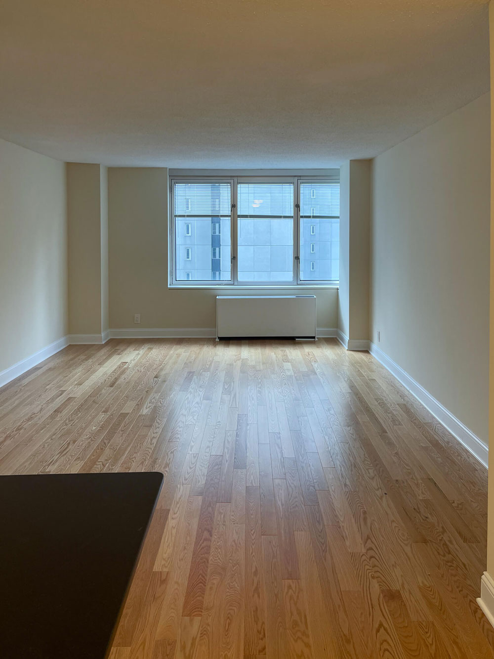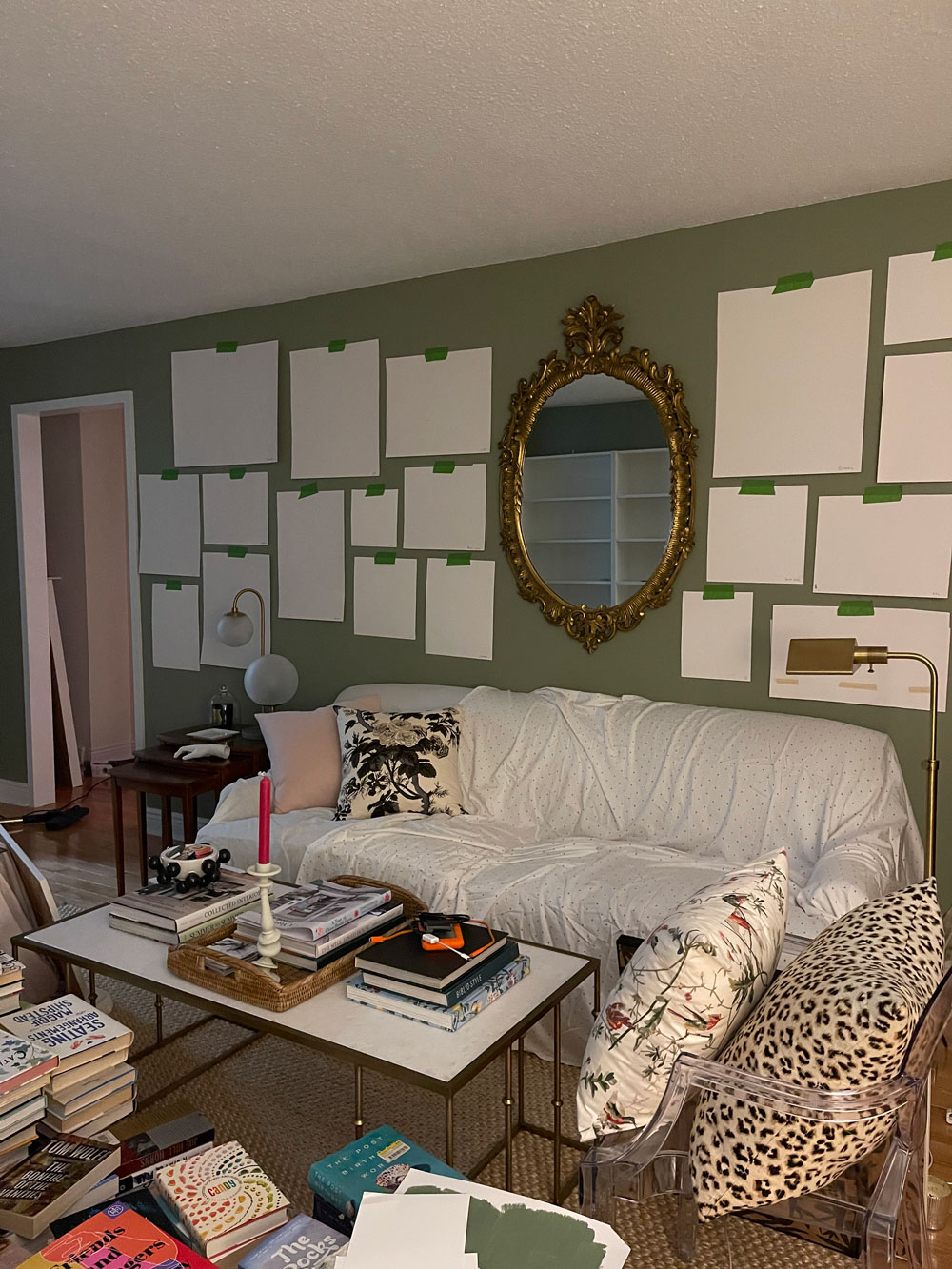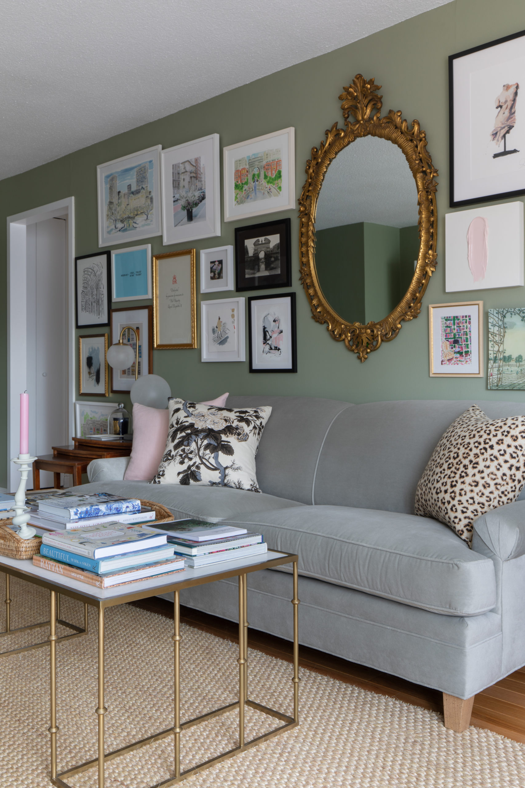
My gallery wall is finally up! It was pretty rough living for a month or two with all of my art on the floor in the living room, so I couldn’t be happier to have it off the floor and on the wall. Sources are at the end! Here’s a couple of before and in-progress shots:
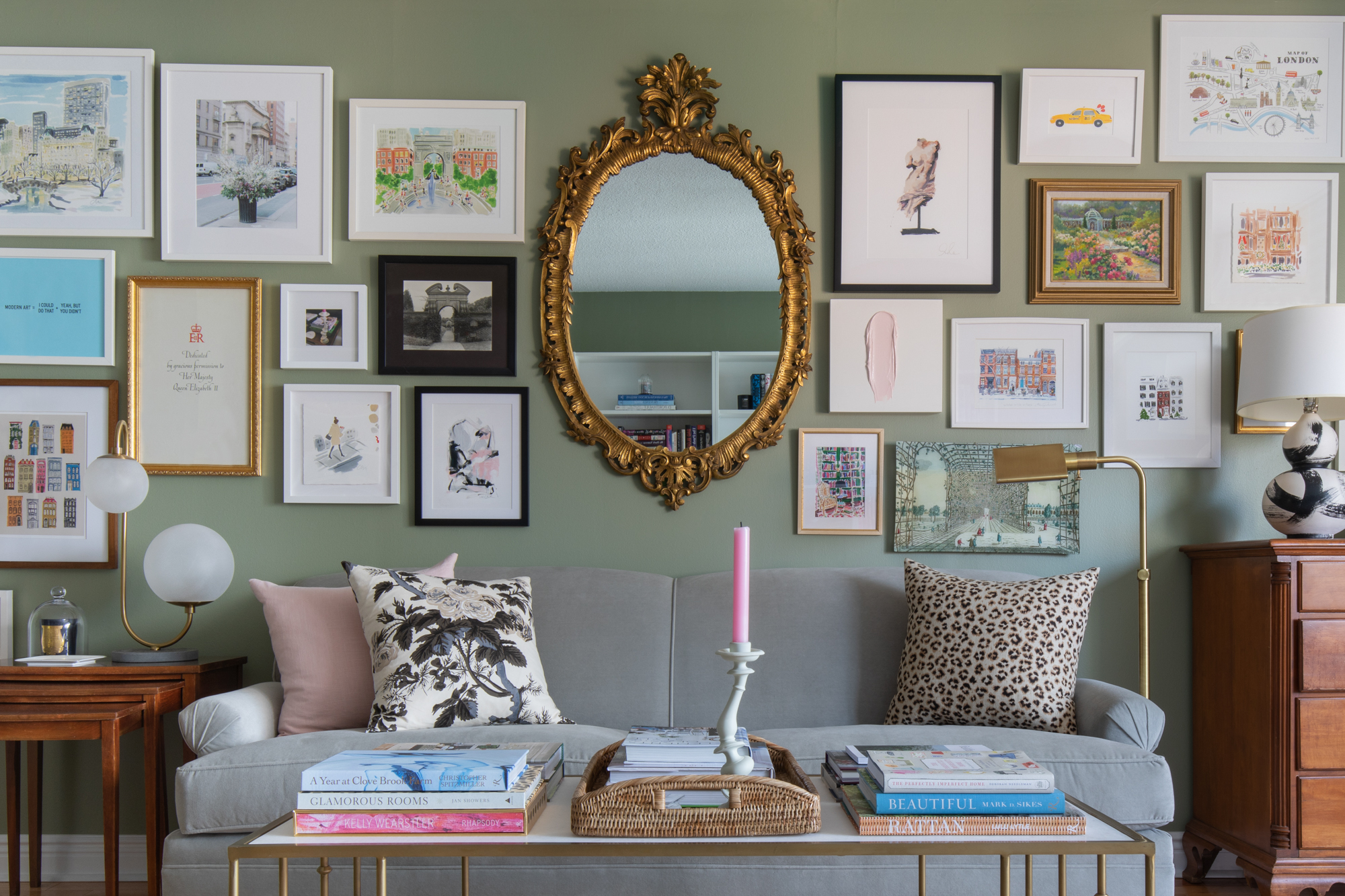
Left is before moving in – the gallery wall wound up on the left hand side wall. The right is in-progress – sofa is covered because my sister’s cat was visiting and the books are all over the floor because my bookshelves were in progress. A hot mess! And, after:
Since I have two rooms this go-round, I got a little overwhelmed at the idea of what should go where – should some be out here and some in the bedroom? Should I not go totally wall-to-wall with this? Then one day I was just like ya know what I can’t take this mess anymore, so I just dove in! I did a quick once-over and separated out anything that I thought looked vastly better on the pink walls of the bedroom vs. the green out here, and I put those in the bedroom to be dealt with at a later date – it was pretty much just two or three pieces. Then I just went ahead and started working on arranging everything in here.
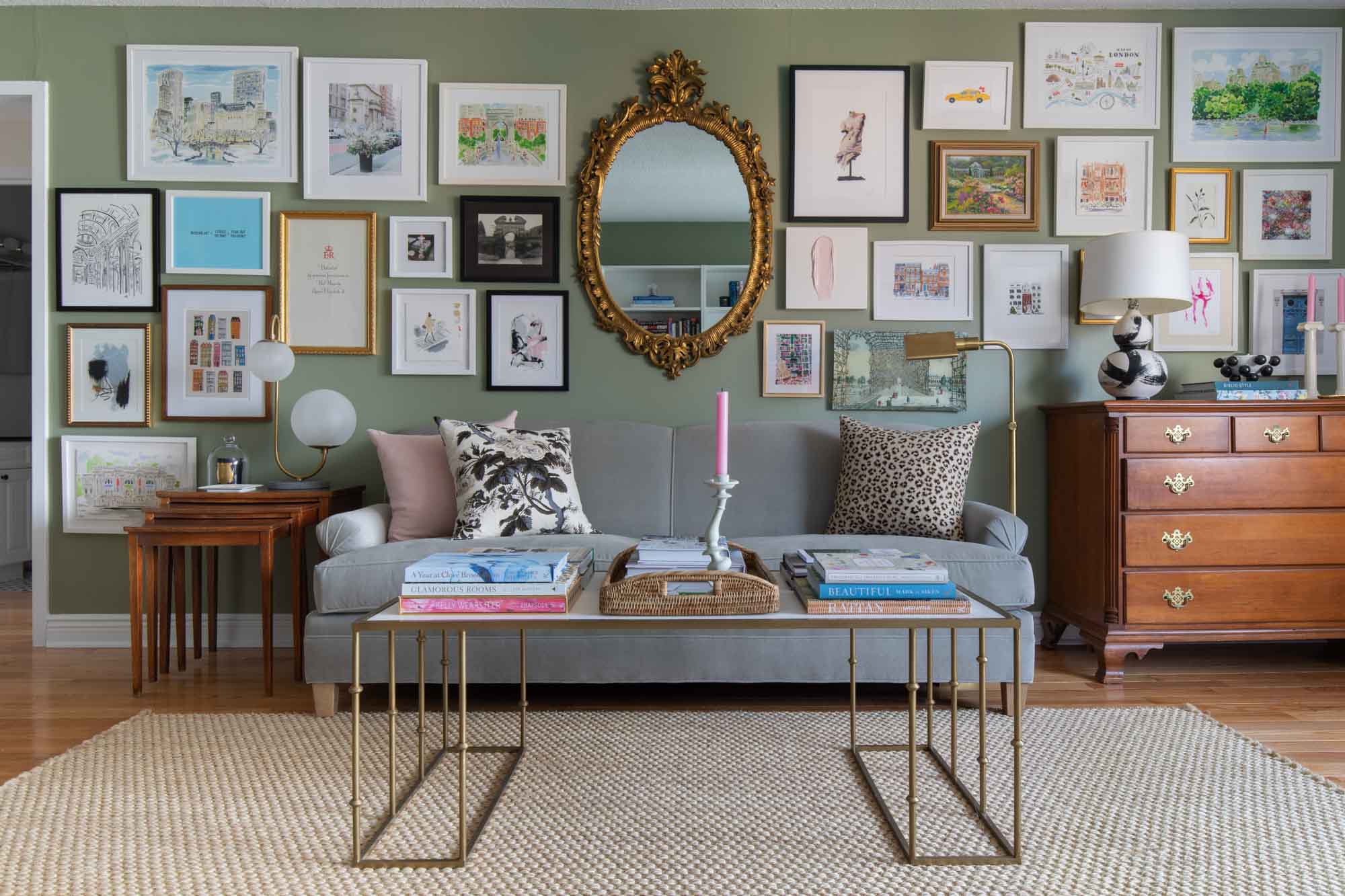
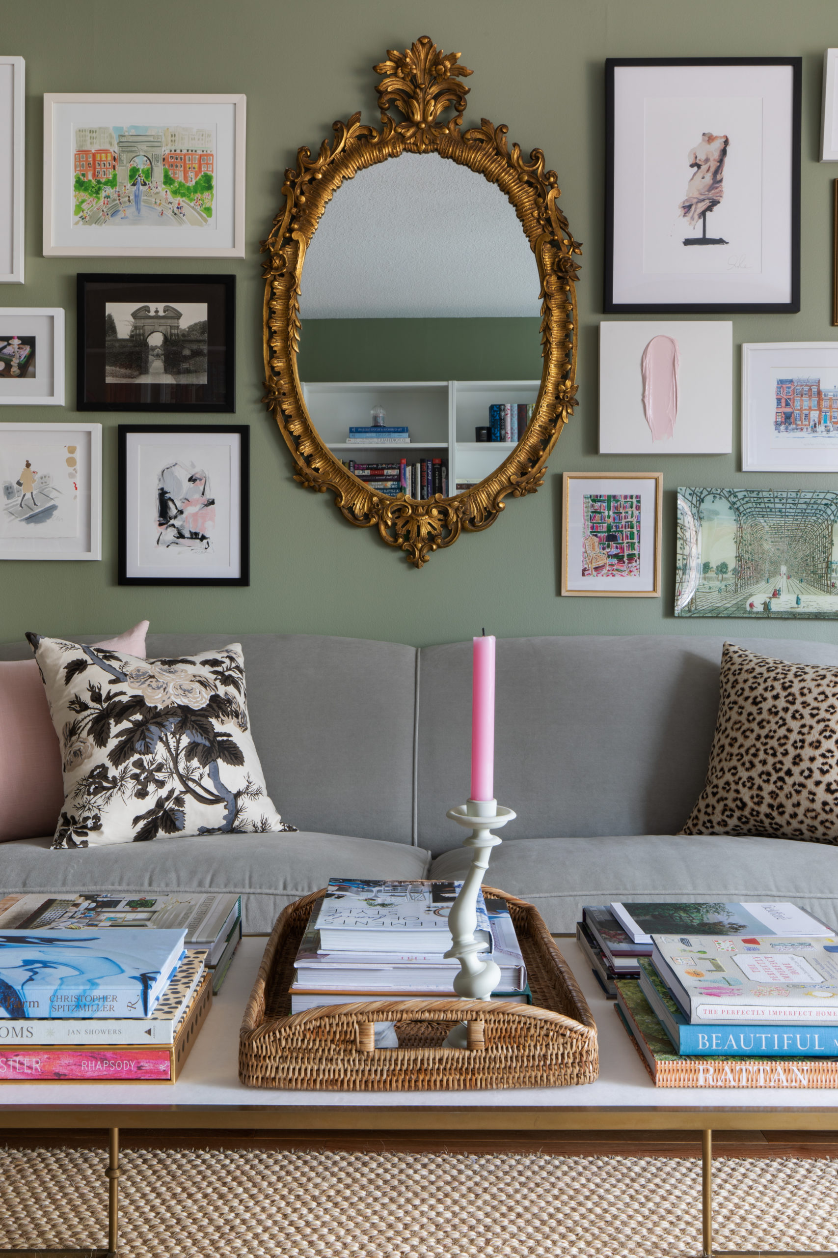
I’ve made a lot of gallery walls in my day but this was the first one I’ve had to make where there was something immovable anchoring the whole arrangement – in this case, the big vintage gilded mirror. Not that it was actually immovable, but there was only one appropriate spot for it (and once it was hung it was virtually immovable!), so the composition of the art really had to be arranged around it. So of course, hanging the mirror dead center in the wall was the first step. Then I followed my own tutorial to do the rest of the arrangement! Also you would think I could’ve taken the time to straighten all of the frames before photographing but apparently not. I prefer to think of it as a sort of British-inspired design insouciance…just go with it.
I did the same sort of wallpaper-inspired gallery wall design here that I did in my last place – mainly because I have so much art and the size of the mirror pretty much removed the option of doing just an over-the-sofa arrangement, even if I’d wanted to. I do think I probably should’ve made the spacing a little bigger and left a little more breathing room between each piece, but life isn’t perfect, what can I say. Truth be told I’m not very patient with projects like this…hanging a gallery wall is a lot of work and well, be more patient than me, would be my advice! (side-note, there’s nothing wrong with close spacing, I just don’t think it was totally necessary here). Anyway Kate and Andy Spade’s gallery wall is my forever inspiration when it comes to this type of wall-to-wall, floor-to-ceiling wallpaper effect sort of gallery wall.
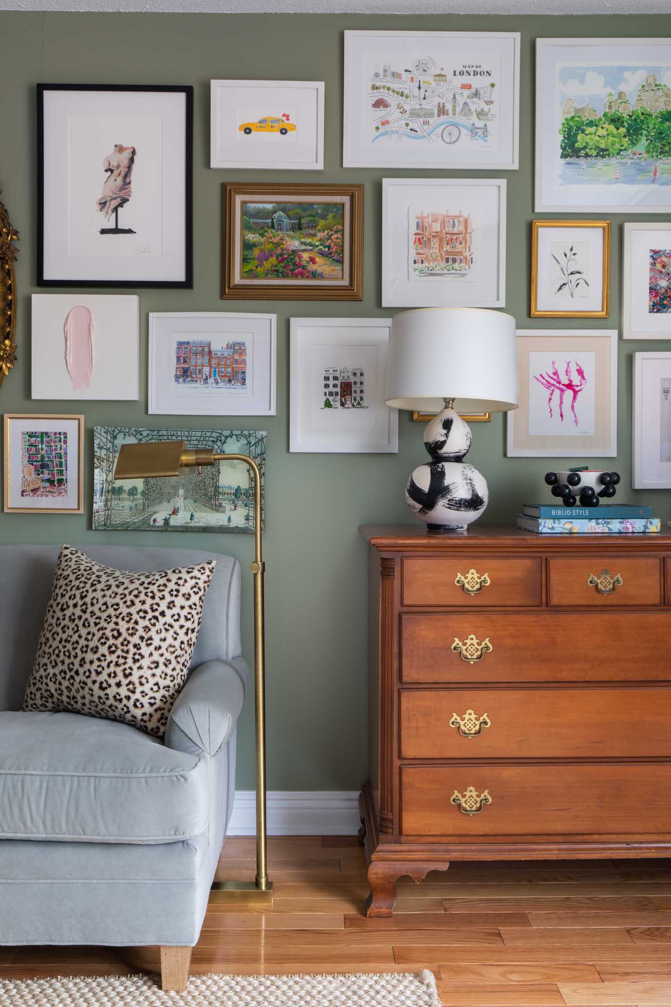
If you look at the full horizontal at the top of the post, you can see that I tried to keep things roughly – not symmetrical – but visually balanced. So I took my two biggest pieces (the Caitlin McGauley prints) and tried to get them roughly opposite each other on the right and left top corners. As always, the biggest challenge with gallery walls for me is getting things mixed up and not in rows. It’s kind of hard to explain, but you’re dealing pretty much with a bunch of squares – and the sizes don’t vary wildly – so it’s hard to not wind up with just rows of art. What I’m always striving for is more of a puzzle effect, or like a random zigzag effect, if that makes sense. You basically want it to look random, but based on the shapes you’re working with that can be really tough. Sometimes I’m like man I really need some long skinny piece to slot in and break things up! I did my best but I’d say that’s always the biggest challenge. Also you can see that I brought the art down pretty low towards the couch. A really common problem that you see all the time is art being hung too high. If I can give any advice, it’s that you want the art to be visually connected to the thing it’s above (in this case, the sofa). They’re part of the same vignette. So don’t be afraid to bring art low – to a dresser, a sofa, whatever it is it’s hung above. The thing you don’t want is for your art to seem like it’s randomly floating in space, really far away from the sofa (or dresser, etc) – remember they should always be a unit, in a way.
As I’ve been looking at this, I’m more and more pleased that I went back for this mirror. For anyone who doesn’t know the story, I saw this gilded mirror in a thrift store in the Hamptons before I ever imagined I was moving, and I liked it a lot but had no spot for it in my previous space. When I did find out I was moving, I called them and was thrilled to find out it was still there! It’s so pretty (I think it’s gold leaf), and just a really striking piece. To be honest, my preference for gallery walls is not to build them out around a mirror, but this was the best spot for the piece so I worked with what I had (for whatever reason I just really didn’t want it in my bedroom – I’m not convinced that I need a mirror above the dresser there but we’ll see what happens). Anyway I just love the shape and the details, and I think it adds a lot of character.
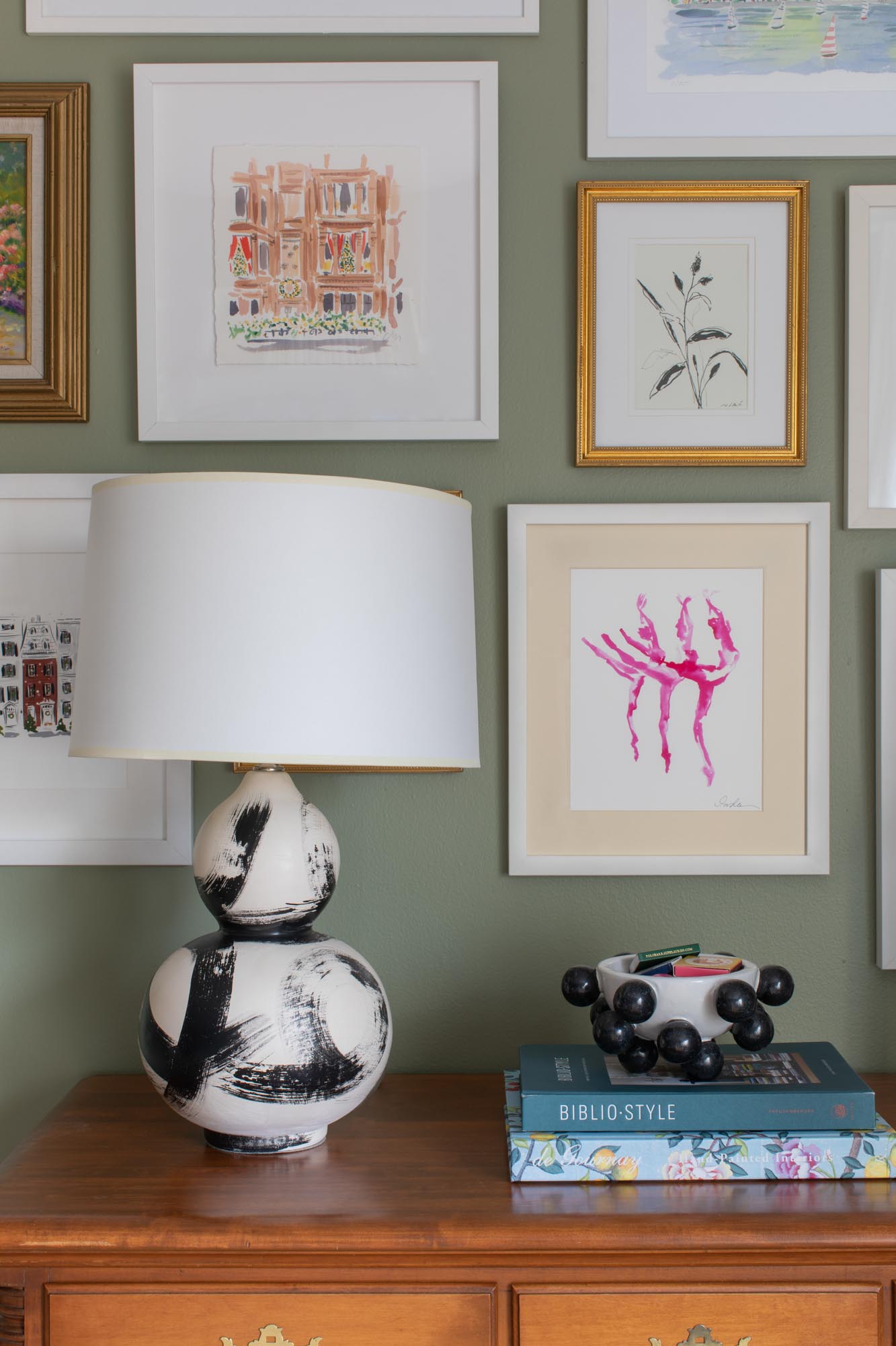
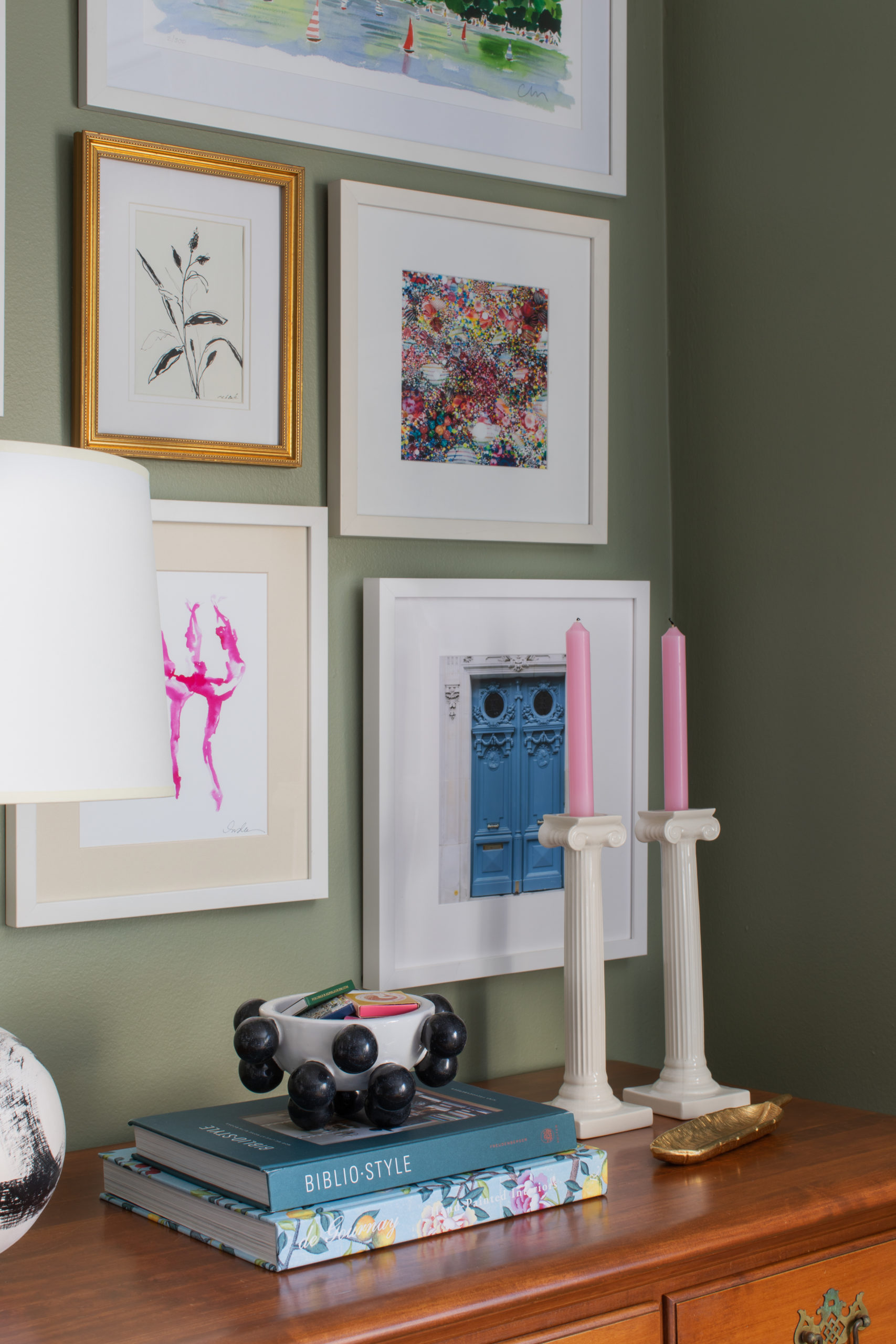
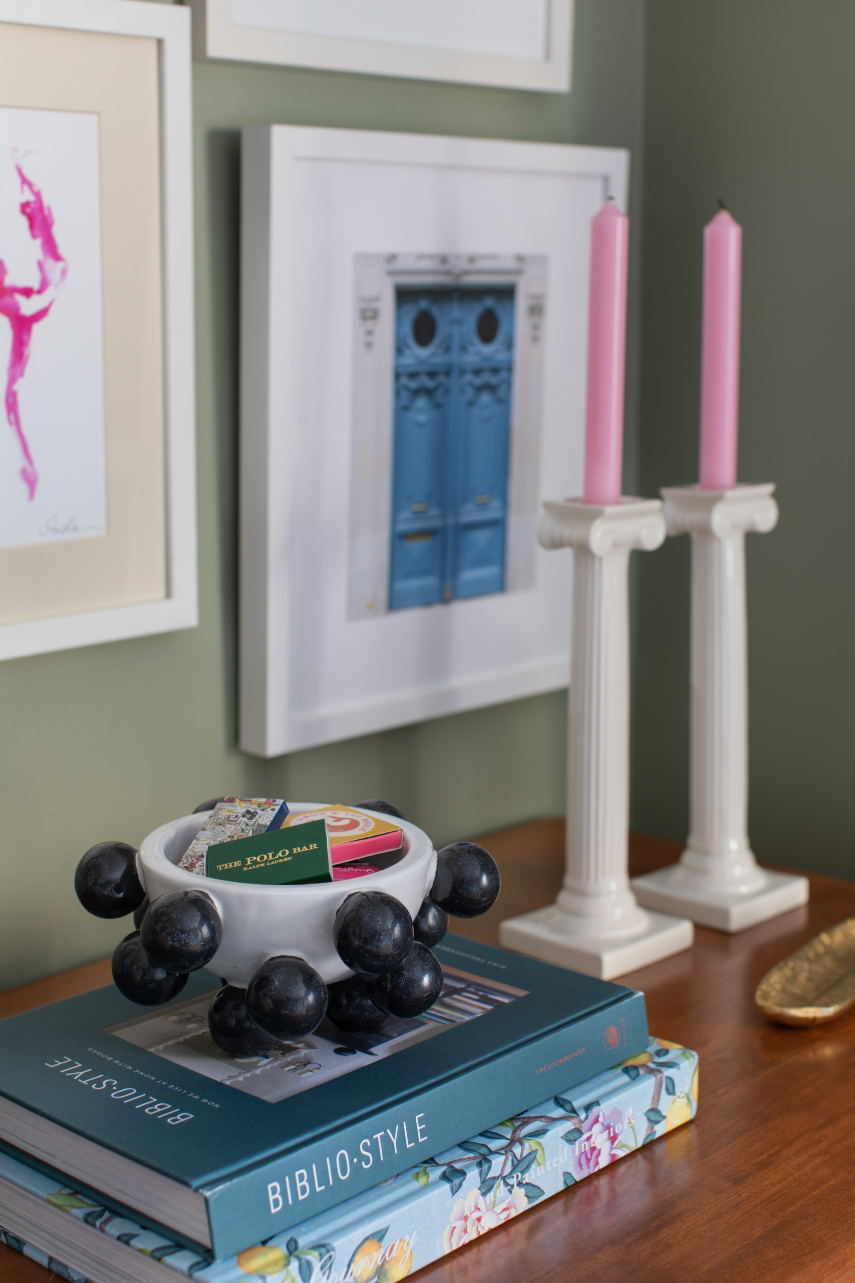
Just a few of my favorite things – my Pentreath and Hall candesticks with their Dahlia Dinner Candle, my Kelly Wearstler mini Pop Bowl, and Bibiostyle, one of my favorite coffee table books. The de Gournay book is so pretty too! The pink “Sugarcoat” print is available here, the ballerinas are from Inslee but no longer available, the blue door is from my Etsy shop, and the gold framed botanical drawing is an original from Christina Baker.
The pieces of art here are ones I’ve collected over the past 11 years, since I moved into my first apartment. Some of it has been with me since that very first apartment in 2010, and others just recently came into my life! If I could give one piece of advice for a gallery wall or just art in your home in general, it would be to collect it over time, from different places – and only pick what you LOVE. Don’t feel like you have to rush and just go to one store or one place and pick up five pieces that all look the same. You can always just start with a small gallery wall and let it grow as new pieces come into your life. Personally, I have a lot of space in this new place where art needs to go, but I’m not rushing it. As history has taught me, I always wind up coming across things I love (whether it be furniture or art), so I figure I might as well wait until something I love crosses my path, rather than getting something just to fill a hole. And remember that anything can be art – a postcard you find pretty, a page from a vintage book, a map, really the sky’s the limit. You can get objects framed, like matches or other sentimental items. I have a post here about how to build an art collection in an easy and not expensive way that has some helpful tips. So many of the artists I love and whose pieces are on my wall I’ve found through Instagram, and/or through interior designers who have used that artist’s work in their designs. We’re all on IG all the time (for better or worse), so might as well keep your eyes open on there!
I’m thinking of maybe doing a post on tips for finding art or tips for arranging gallery walls, so let me know if you have questions!
Wall color is Farrow and Ball Lichen // Pyne Hollyhock pillow // pink pillow // leopard pillow // nesting tables vintage // lamp old West Elm // coffee table old Ballard // rattan tray no longer available (similar) // Areaware distortion candlestick // Maiden Home Carmine sofa // pharmacy lamp // Jana Bek brushstrokes lamp // rug is Stark carpet
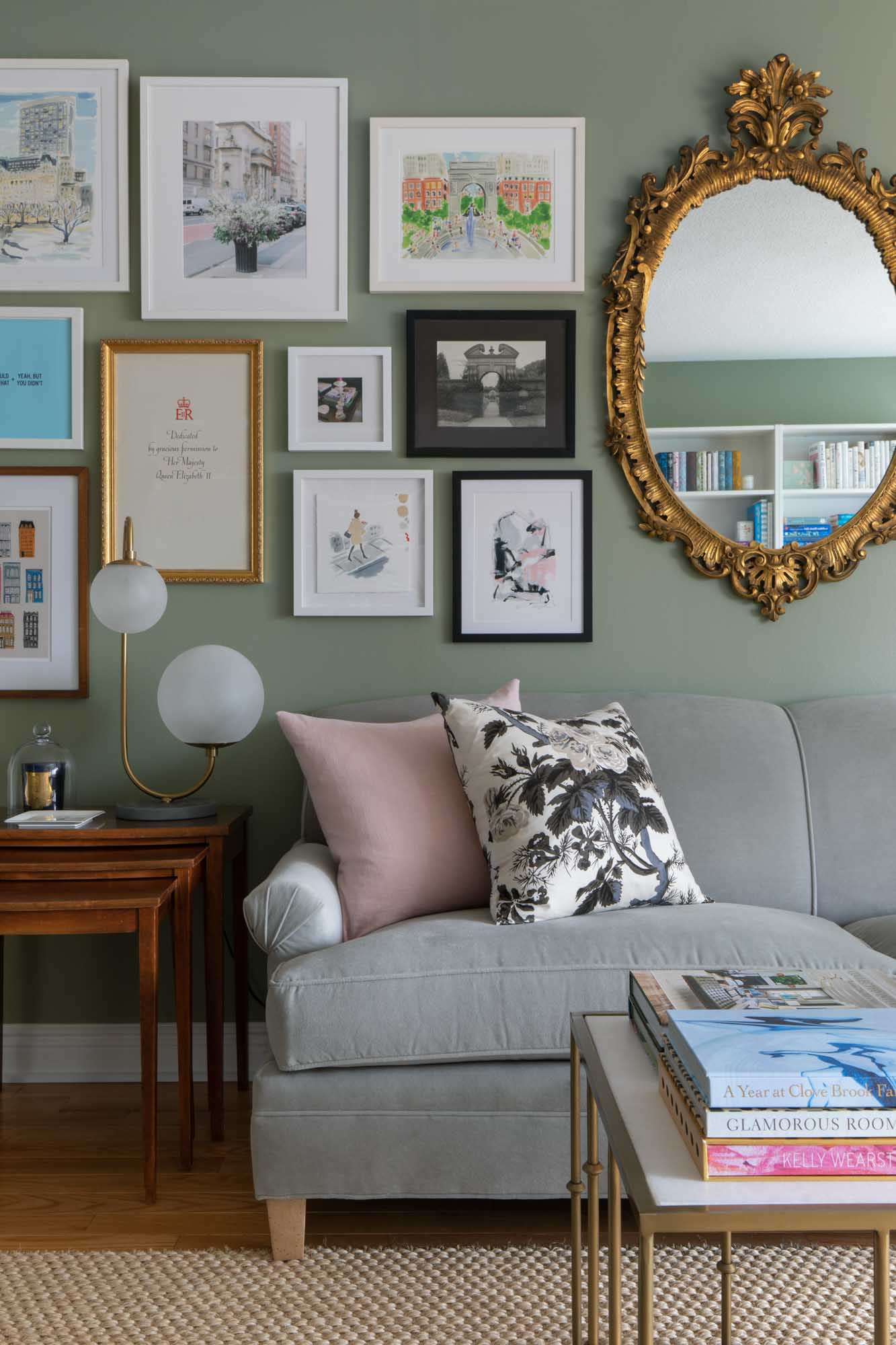
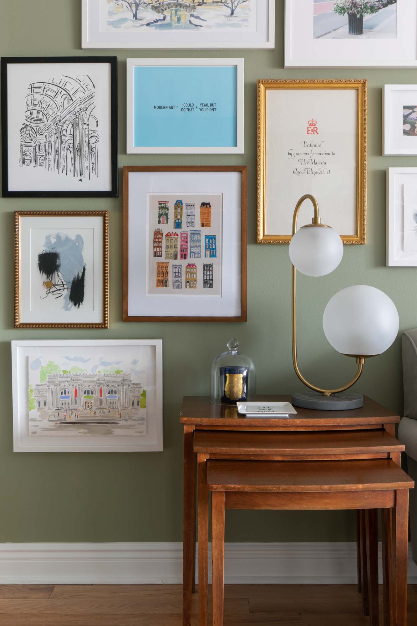
art on left side of mirror, left to right: Caitlin McGauley Gapstow Bridge // Flower Flash available here // Caitlin McGauley Washington Square Park print // Modern Art print // piece in gilded frame is vintage // small piece is a personal photo // black and white is a film photo my sister took // townhouse print Danielle Kroll // girl walking is a Caitlin McGauley original // black and pink abstract is an original Christina Baker
art on right side of mirror, left to right: Inslee print // taxi is a Caitlin McGauley original // London print Alice Tait // gilded framed piece is an original by Roseanne Kaloustian // Christmas townhouse piece is a Caitlin McGauley original // pink brushstroke is Andy Blank // brick buildings Kazuya Morimoto // next to that is a piece Jennifer Vallez created based on one of my Instagrams // small piece is Caitlin McGauley // tray is John Derian // frames are Framebridge, some cheap ones from Amazon (I love this gold one and this simple white one), and others were framed locally.
Answering Gallery Wall FAQs // a tour of the gallery wall in my previous studio with sources // My New Gallery Wall and How I Made It (with step by step instructions for planning and hanging) // How to Build an Art Collection on a Budget //another post with step by step tips on creating a gallery wall // Creating a Gallery Wall for My Sister // One of my First Gallery Walls (lol) // and an even older one (double lol) and another old one, if you still care 🙂

